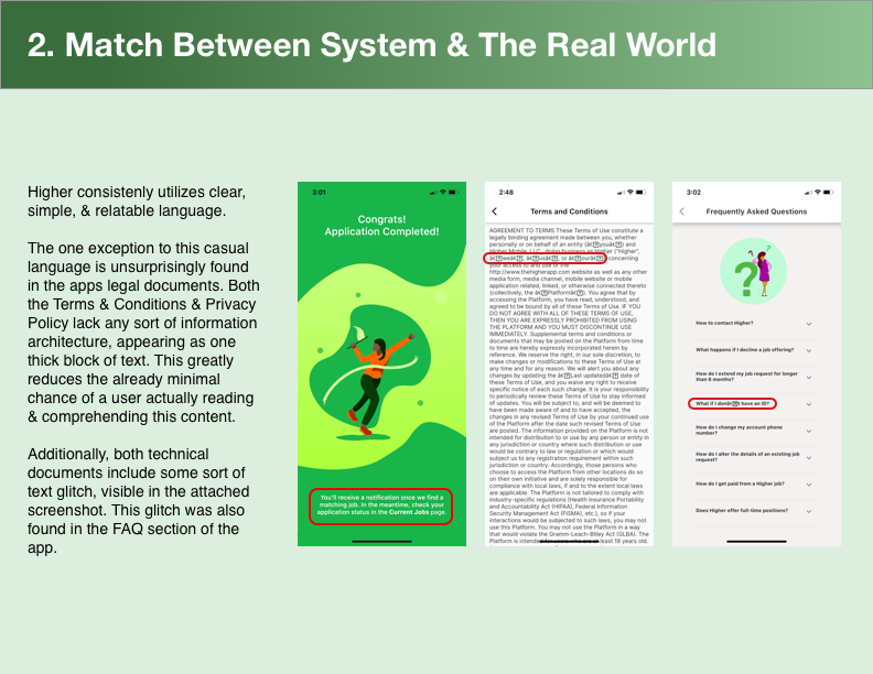
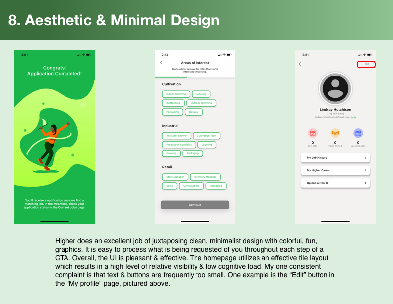
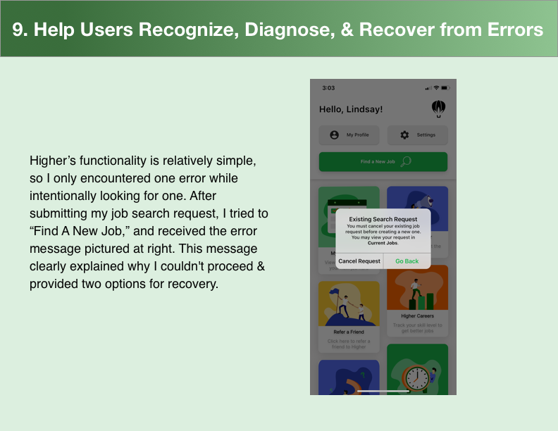
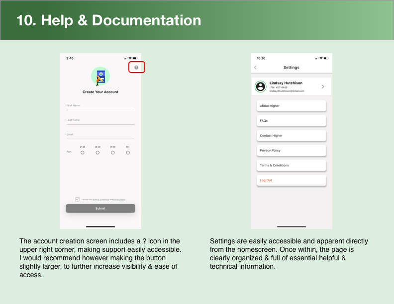
A few contacts of mine recently launched Higher, a free service that helps job seekers to find great gigs with verified employers in the California agricultural sector. Upon release to the App store, I conducted a Heuristic Evaluation based on Nielsen's 10 Usability Heuristics.
"Lindsay's work was a valuable asset in refining the design and usability of our mobile app! Lindsay provided well researched, actionable suggestions and was responsive to our needs for the entirety of our project. I was lucky to work with her and I can't recommend her enough!"
-Cofounder
Top Recommendations
- Adjust the onboarding slideshow to a longer timer and fix the tap to hold function.
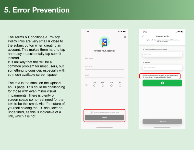
- Increase spacing between terms & conditions link & submit button on sign up page. Too easy to tap the wrong thing as is.
- Remove underlining for, "a picture of yourself holding the ID," because this indicates the text is a link, which it is not.
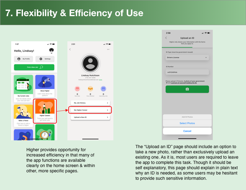
- Add an option to take a new photo when uploading an ID. As is the user has to leave the app in order to do so.
- Make text links and buttons a bit larger to improve accessibility.