Project Noah is an inclusive online community of nature enthusiasts, scientists, and students that doubles as a powerful tool for crowdsourcing ecological data. This data can then be used by independent scientists, nonprofit organizations, & policy makers among others.
Through this project, I hoped to unite my background in conservation with my passion for design. As a former researcher in wildlife monitoring projects, I was easily able to empathize with the needs of the user base.
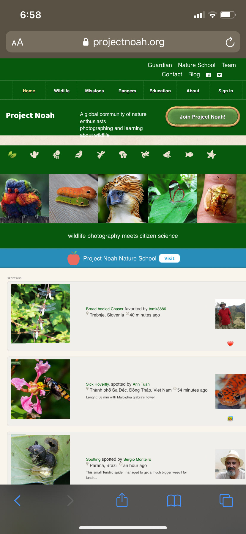
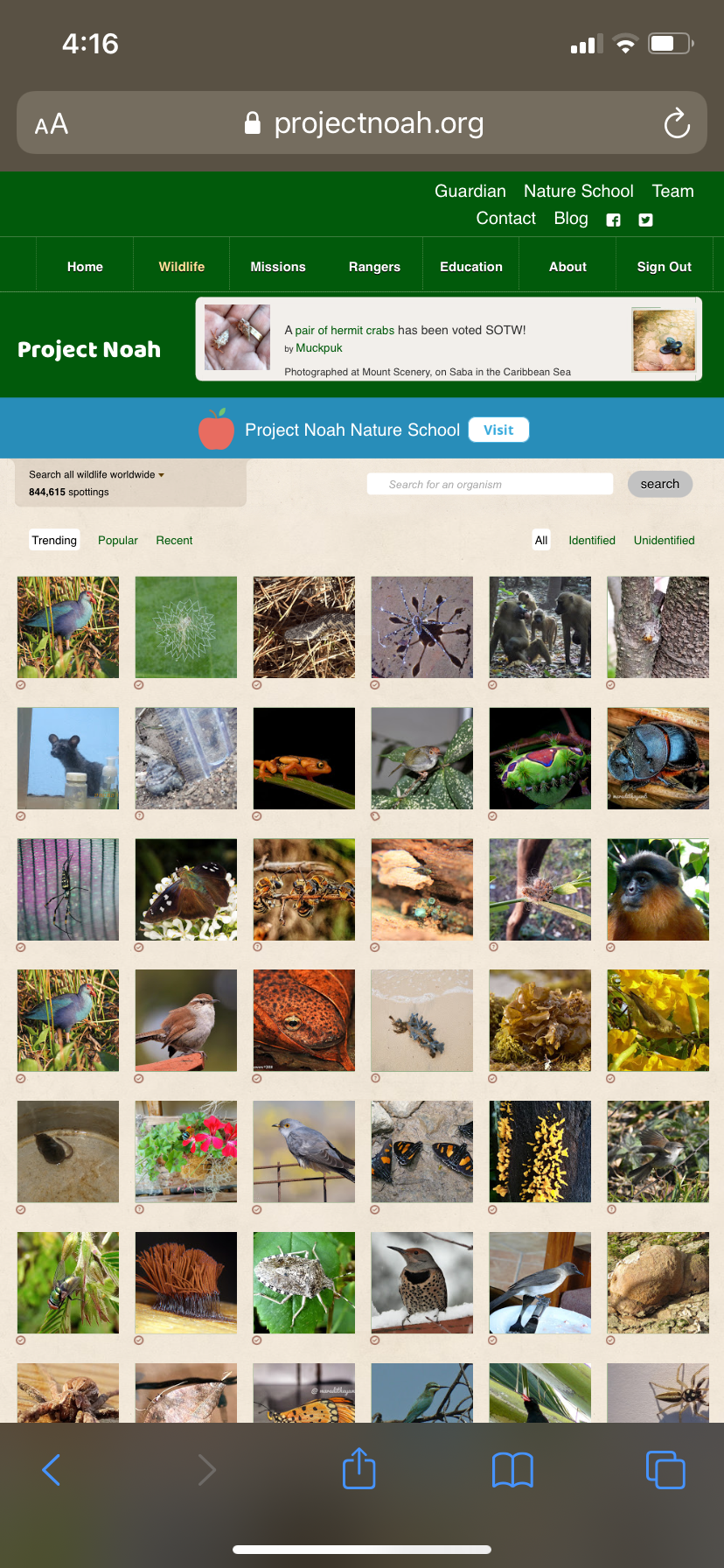
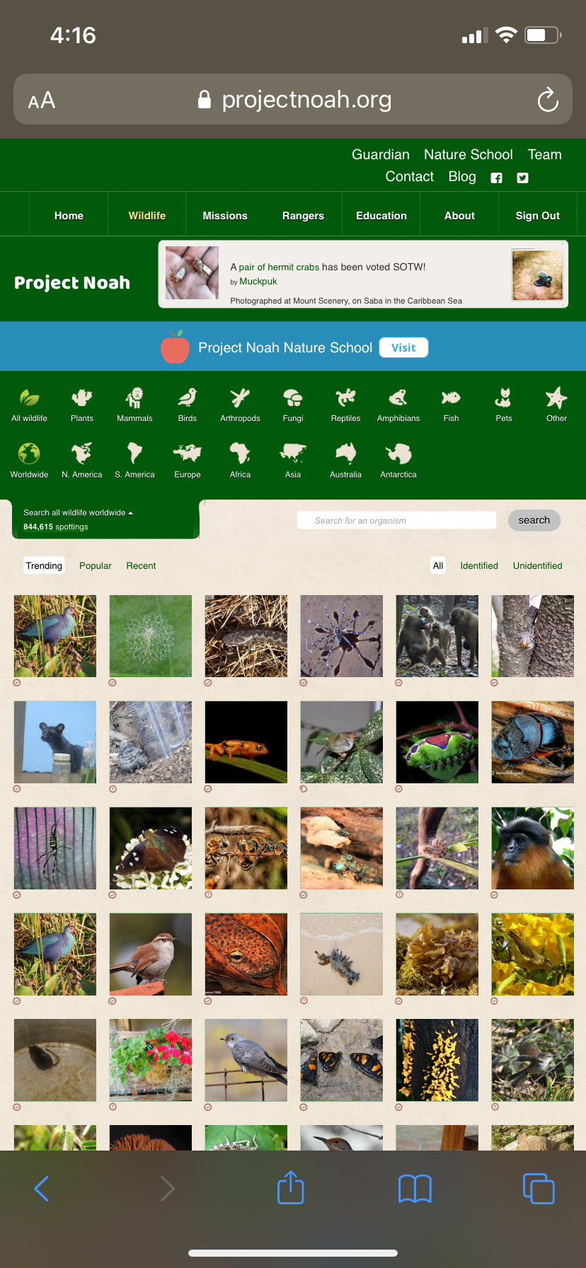
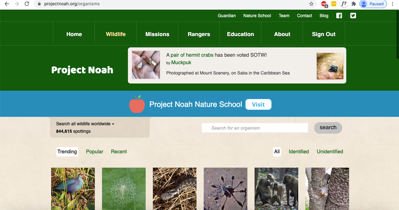
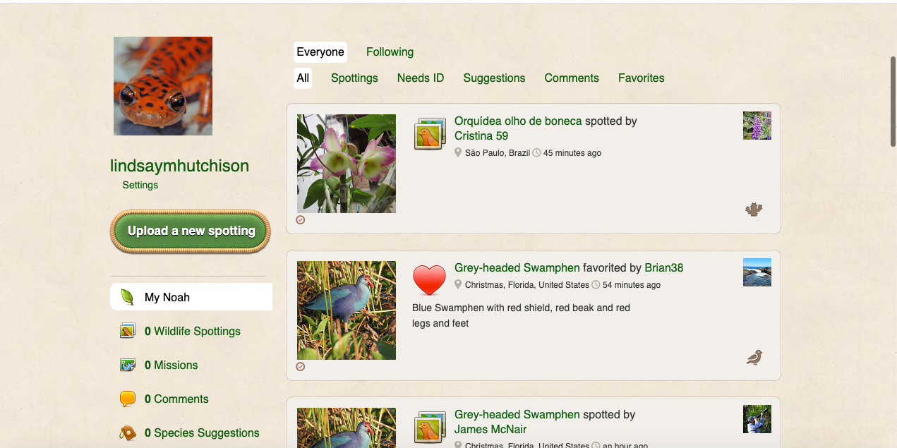
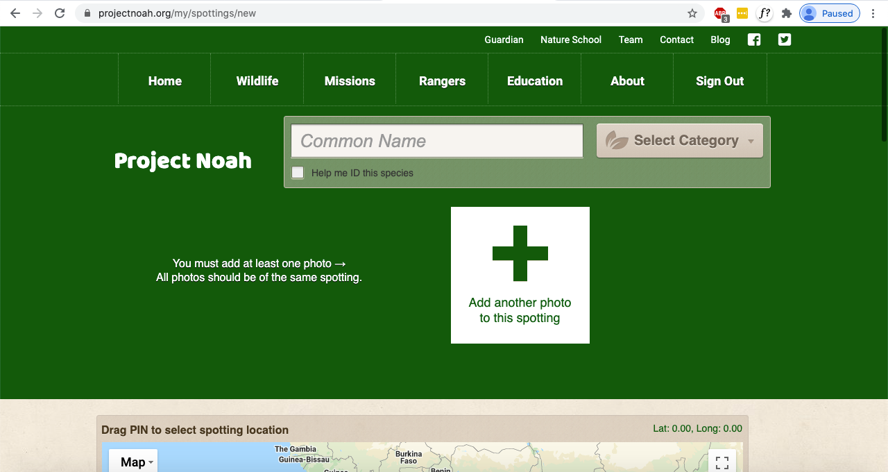
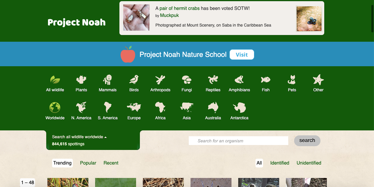
The aesthetic of the existing site is very bold, cartoony, and cluttered. It's non-responsive, which significantly impacts usability for mobile users attempting to report sightings in the field.
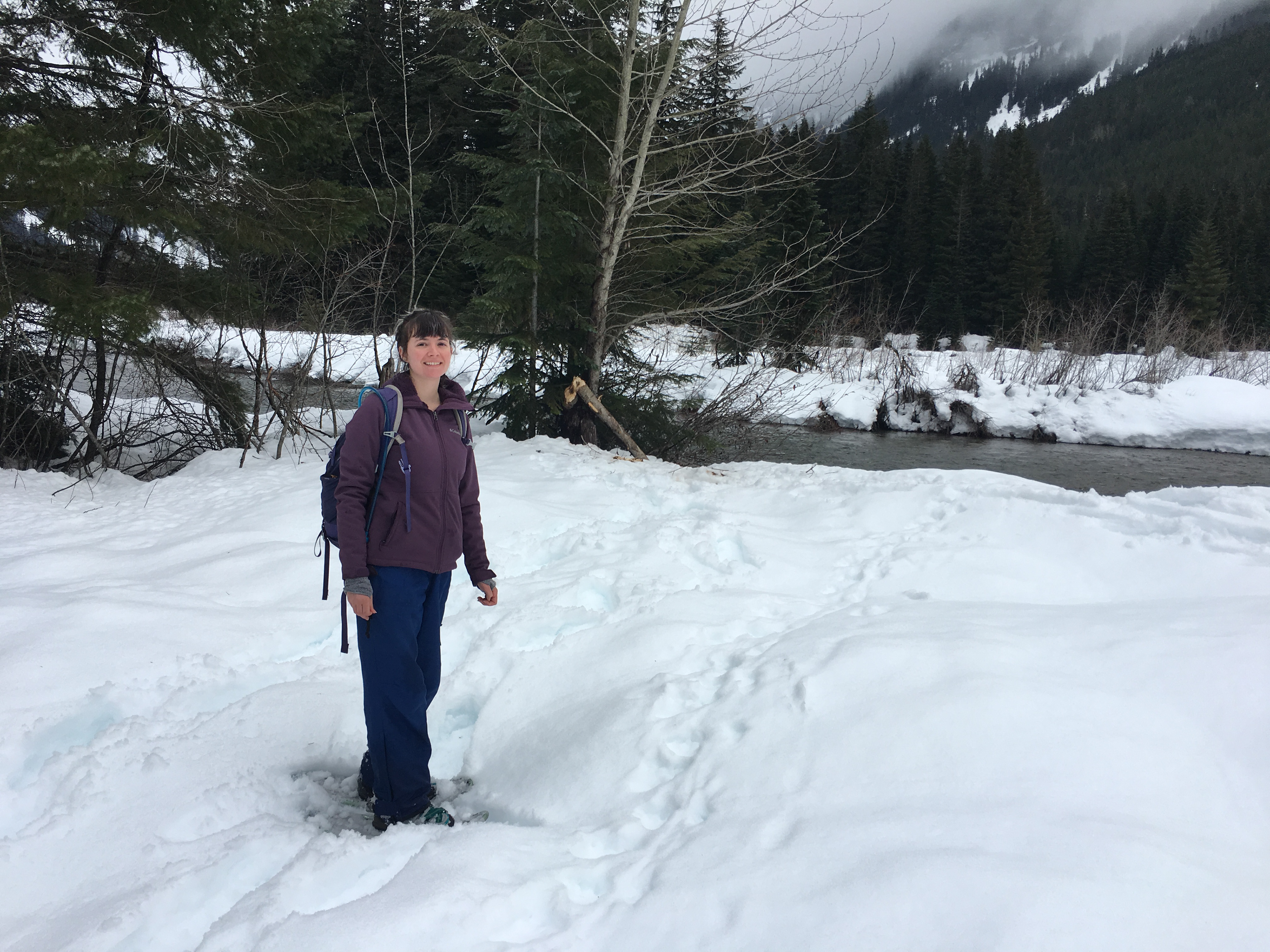
Trying to enter wildlife sighting data on a mobile device with frozen fingers while snowshoeing in the backcountry?
Been there...
Doing so is challenging enough as it is. The platform itself shouldn't make it any harder.
Objective
The goal of this project is to redesign a few of the sites core features with a mobile first approach, as well as add responsive breakpoints. Ultimately, doing so provides users with a more intuitive, efficient, and enjoyable experience.
This is a conceptual project and is not commissioned by the organization.
My Role
I was the sole UI Designer for this project.

Foundational Work
I began by conducting a basic analysis of the existing site focused on identifying key features or lack thereof, points of friction, and UI related shortcomings.
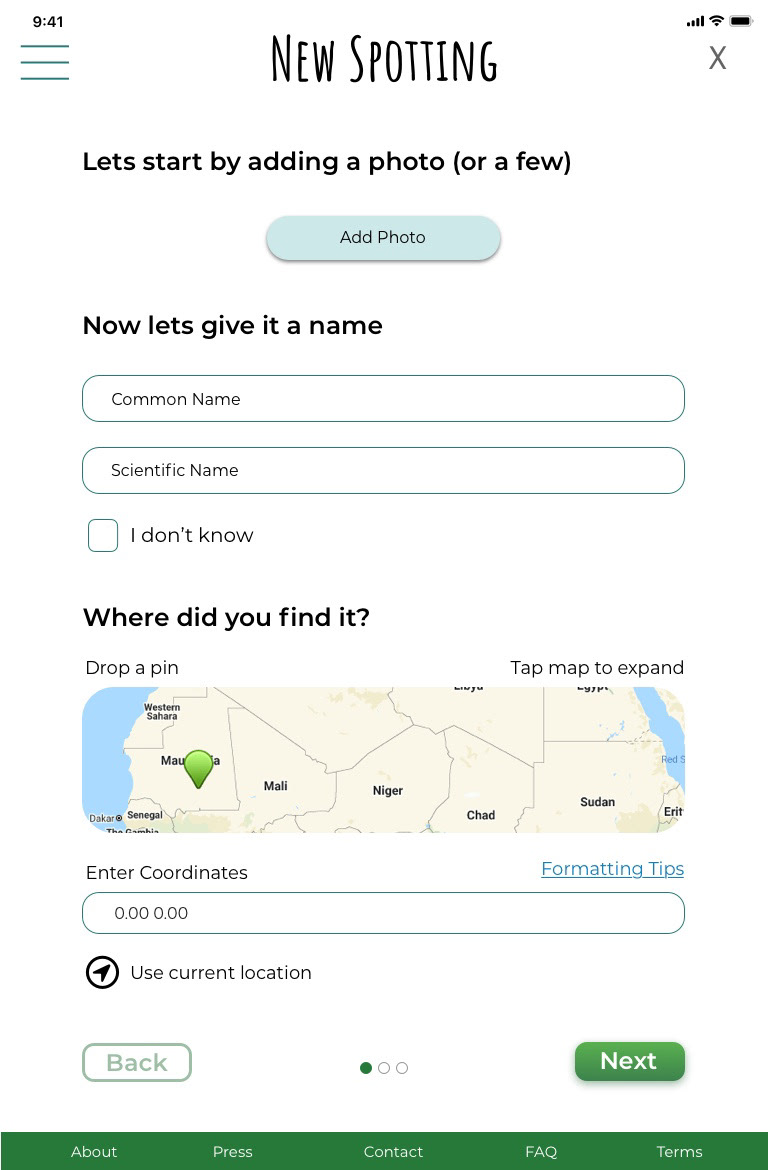
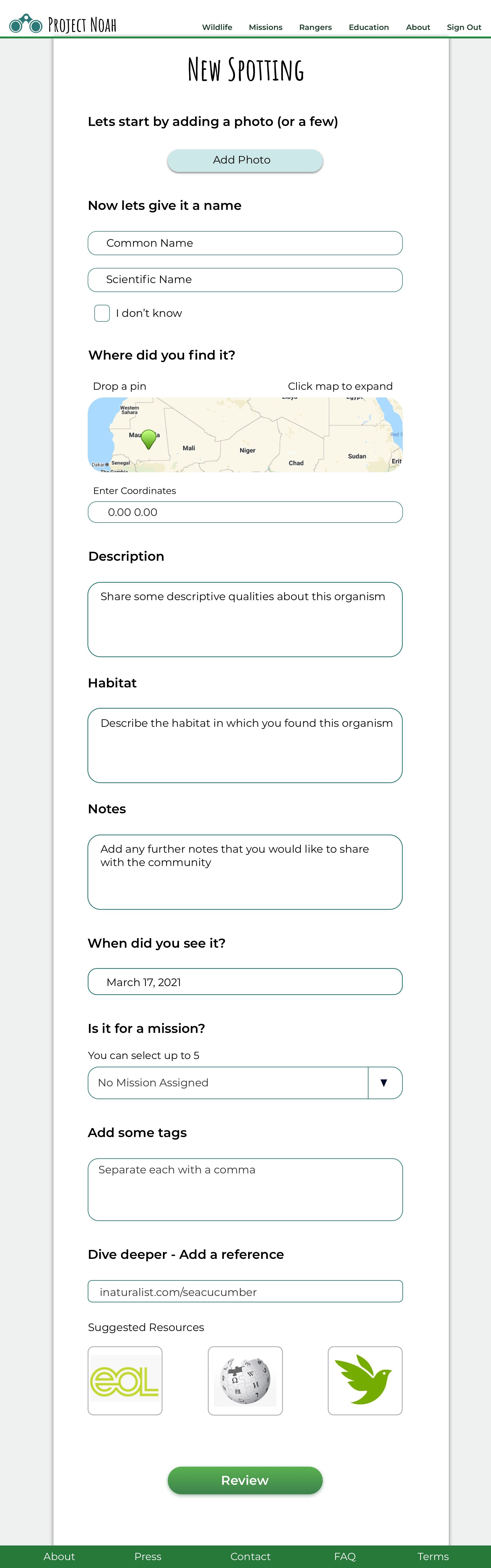
Key Features to Update
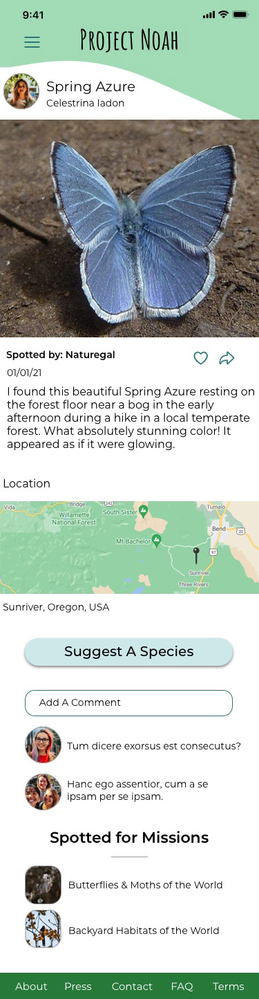
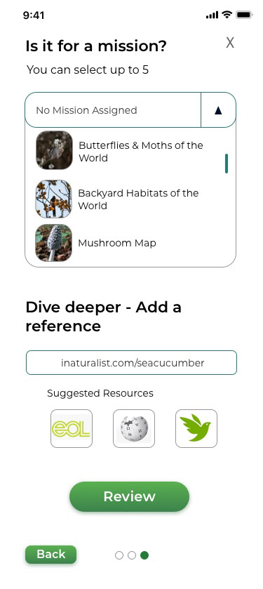
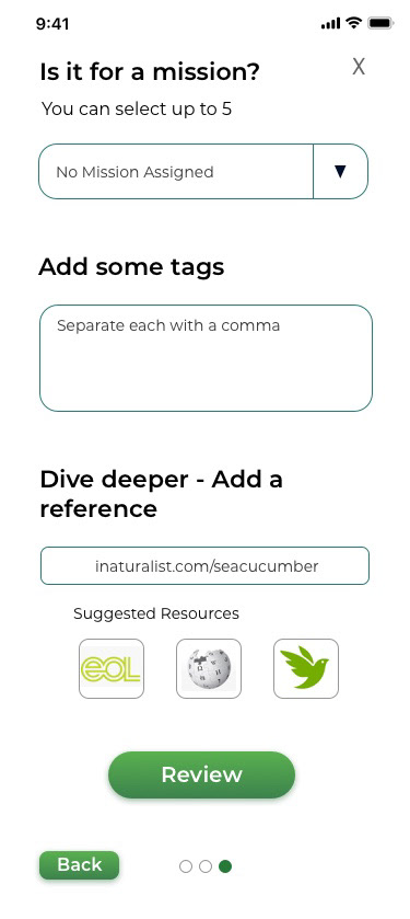
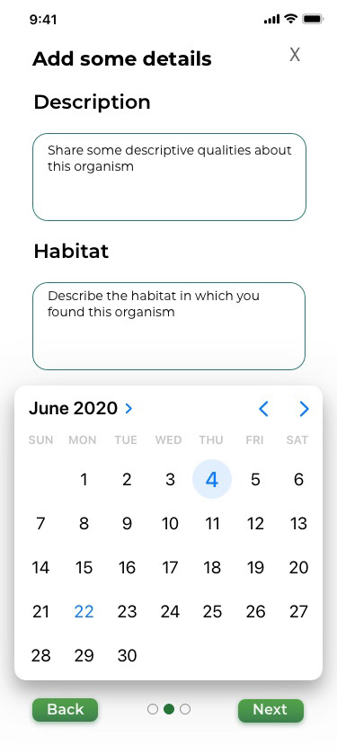
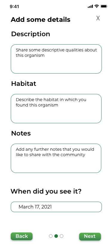
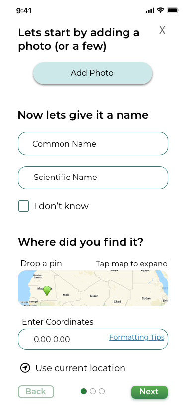
- Upload a new sighting
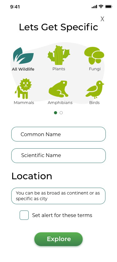
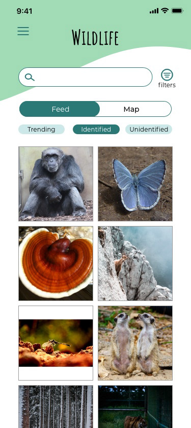
- Search & filter existing sightings
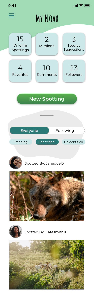
- Home page feed
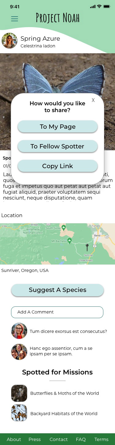
- Post sharing
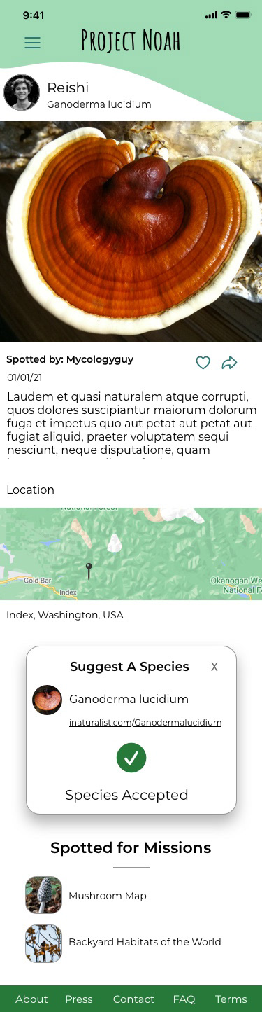
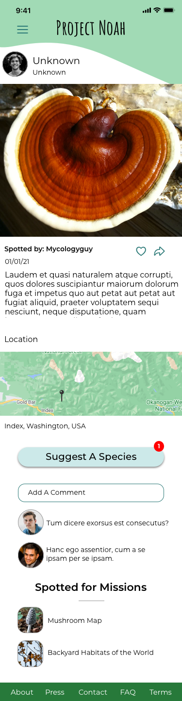
- Suggest a species
Major Pain Points
- Not responsive
- Cheesy and clunky UI
- Lack of visual hierarchy
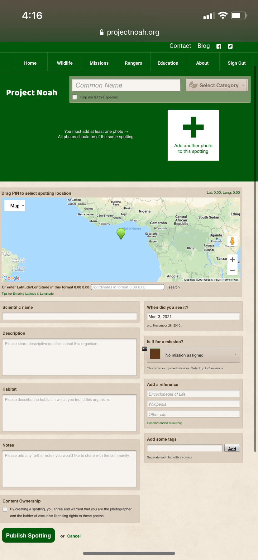
- Confusing form structure
- No option for using current location when tagging a sighting.
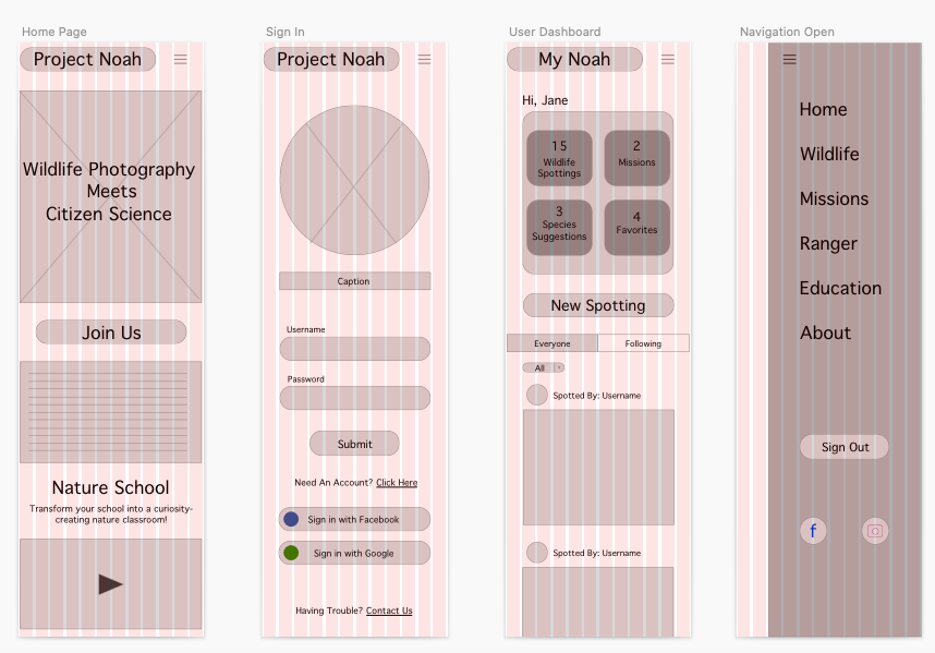
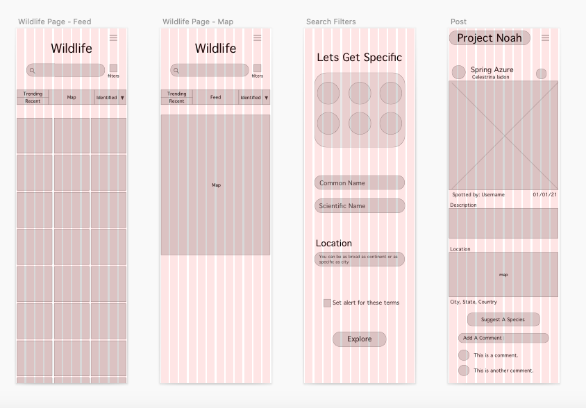
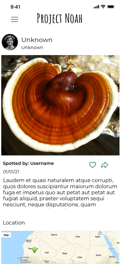
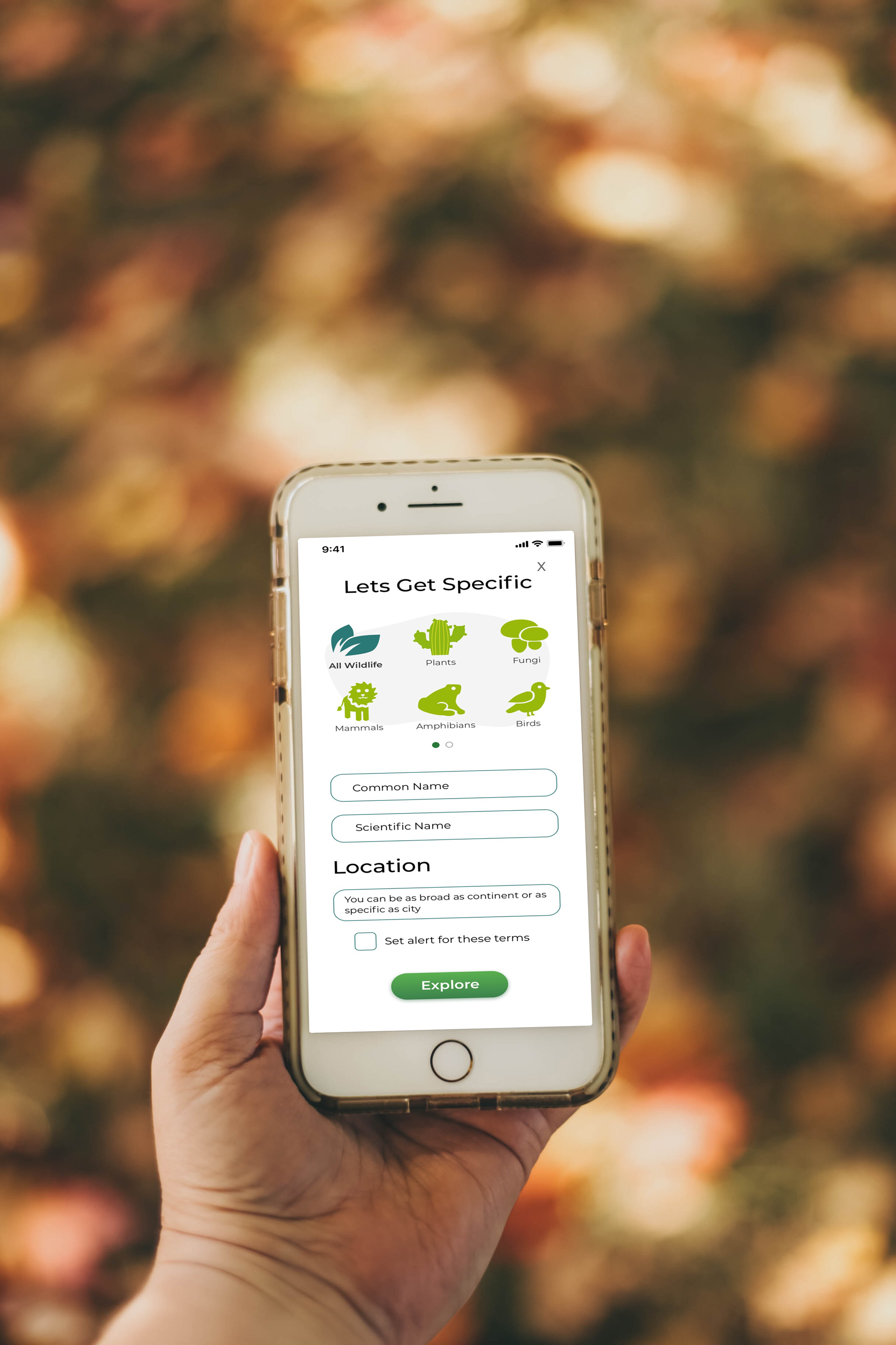
Mobile Screenshots
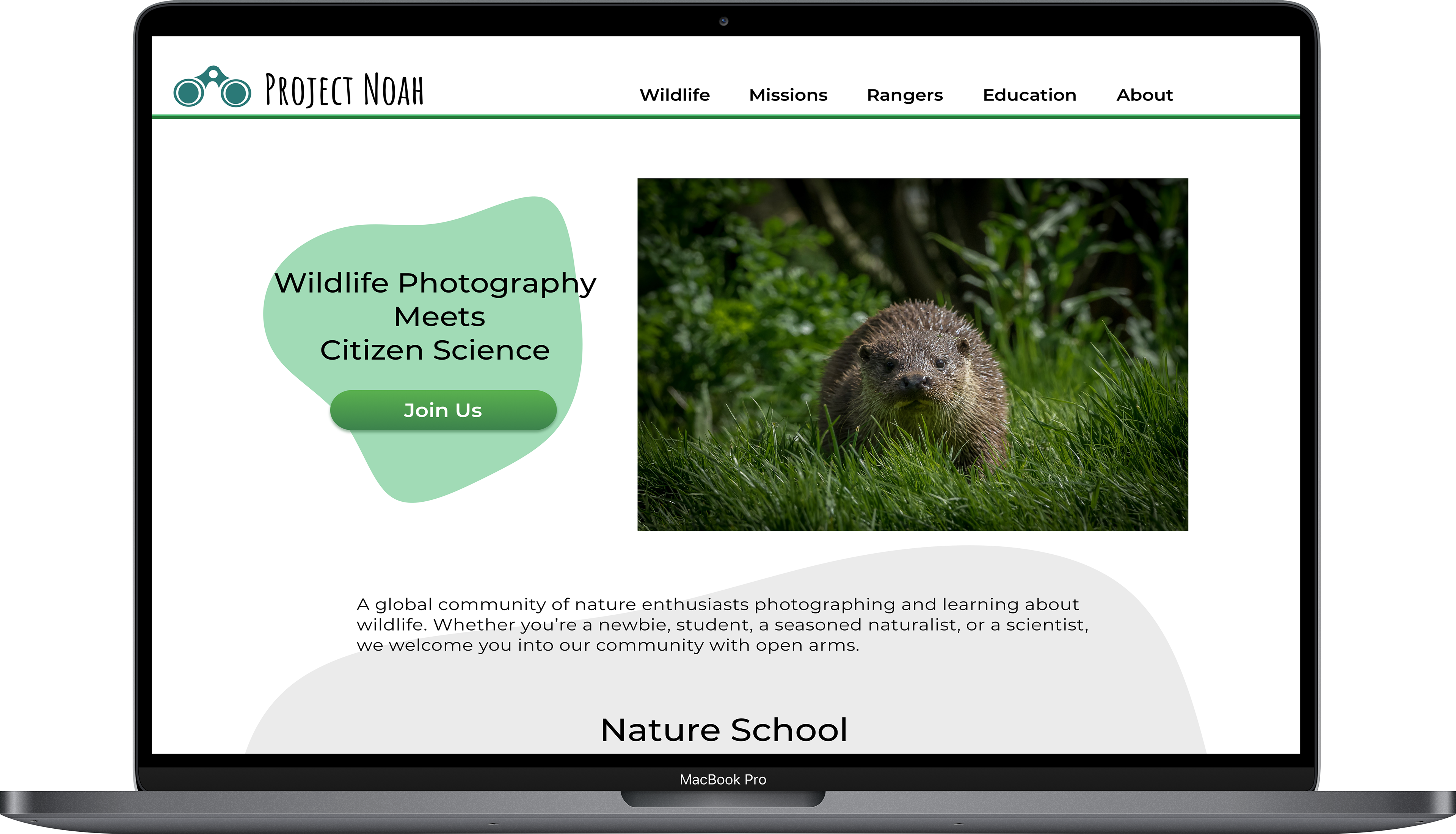
Desktop Screenshots


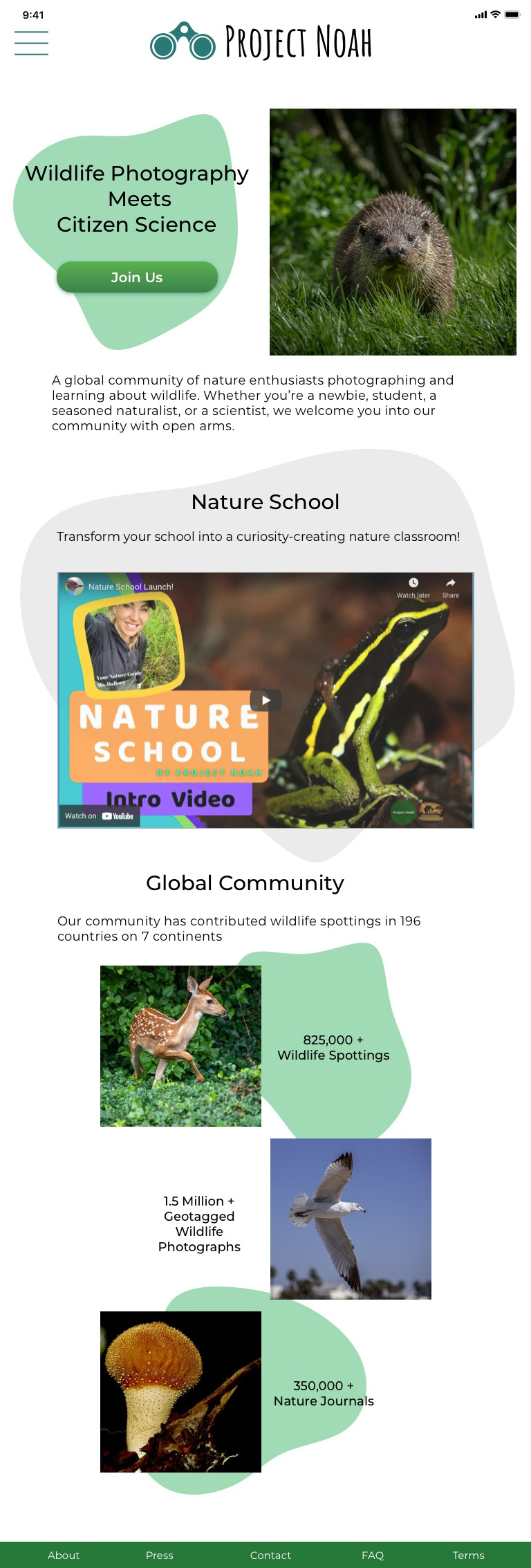
Visual Direction
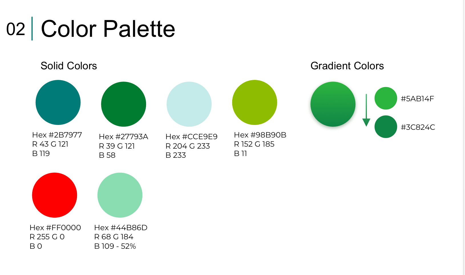
From there I played around with a few moodboards to hone in on the visual direction. I wanted to remain true to the brands welcoming, kid friendly, cartoony style while decreasing cognitive load and improving usability. I settled on a palette of blue and green earth tones as accents to a clean, white background.
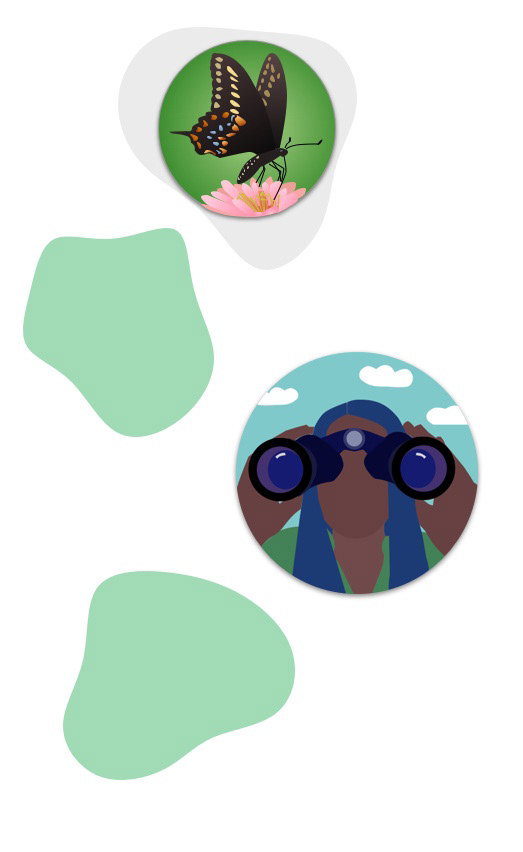
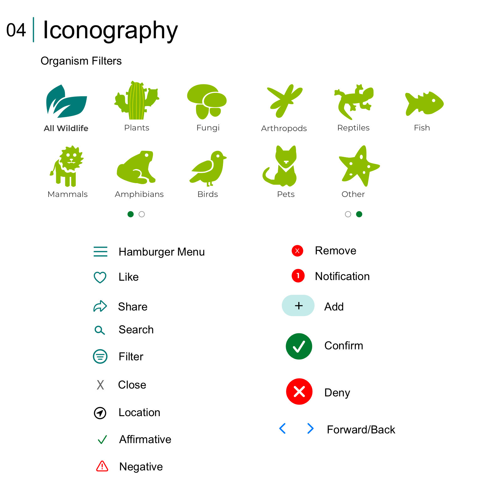
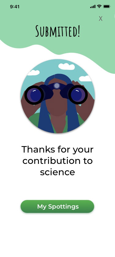
Since the bulk of the sites content is user uploaded photos, I chose to create vector illustrations for all system graphics. This provides stark contrast and immediately informs the user of the context of such images. I also utilized organic "blobs" throughout the UI for an added dose of personality.
The binoculars are featured both in the logo and in the below illustration. I believe that they provide the perfect symbol for the spirit of Project Noah; adventurous, curious, and studious.
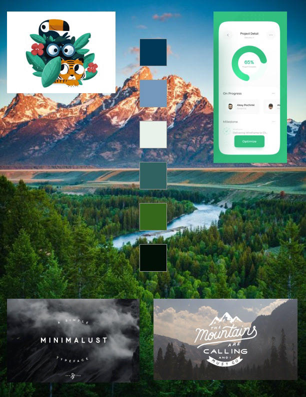
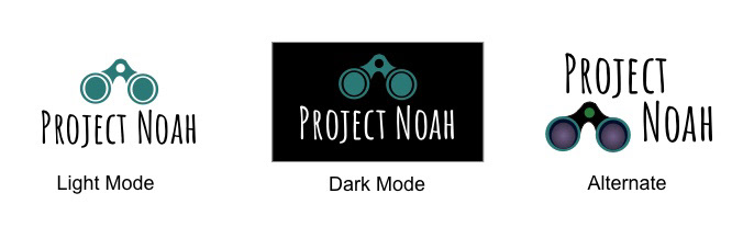
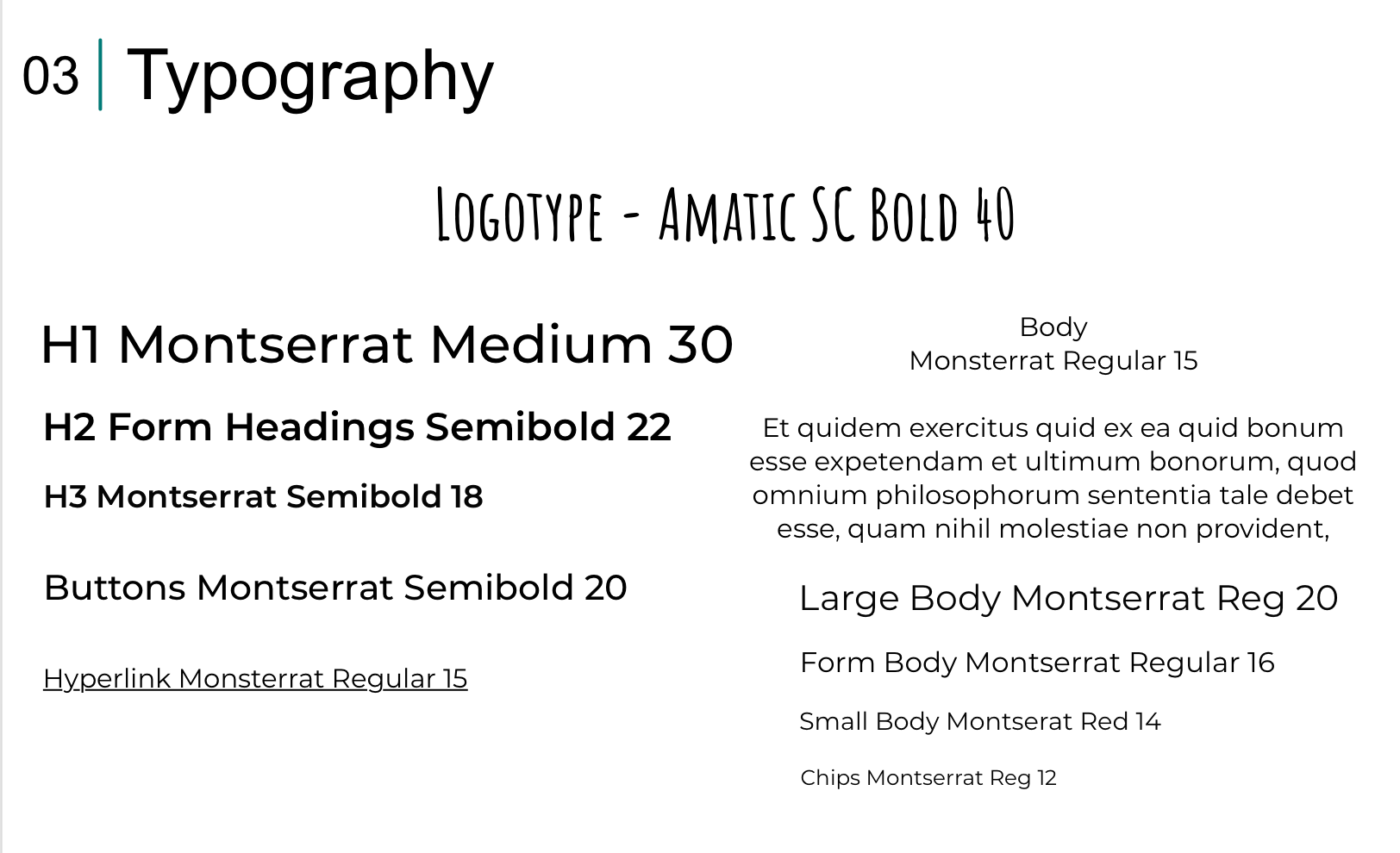
The font, Amatic SC, imparts the perfect, "Into the Wild," adventurous vibe, without being too showy or distracting.
Wireframes
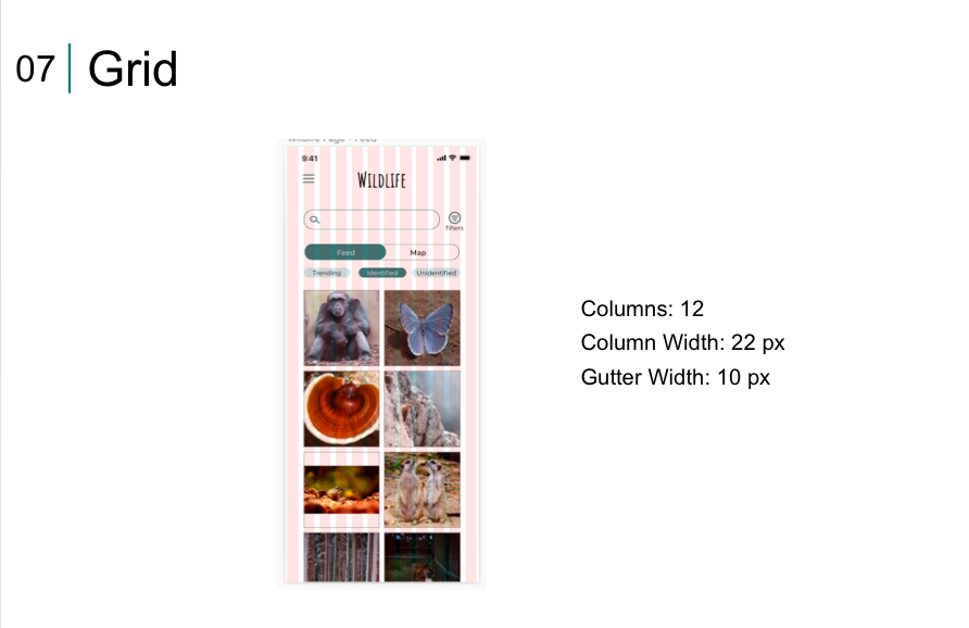
I established a grid and made some low fidelity wireframes. I chose to employ a 12 column grid with the default spacing settings in Sketch. In hindsight, I should have adjusted the grid early on to have a larger side margin. I frequently ran into the issue of content alignment to the outermost column feeling too squished to the edge, and alignment to the next column feeling awkwardly far into the middle.
Low Fidelity
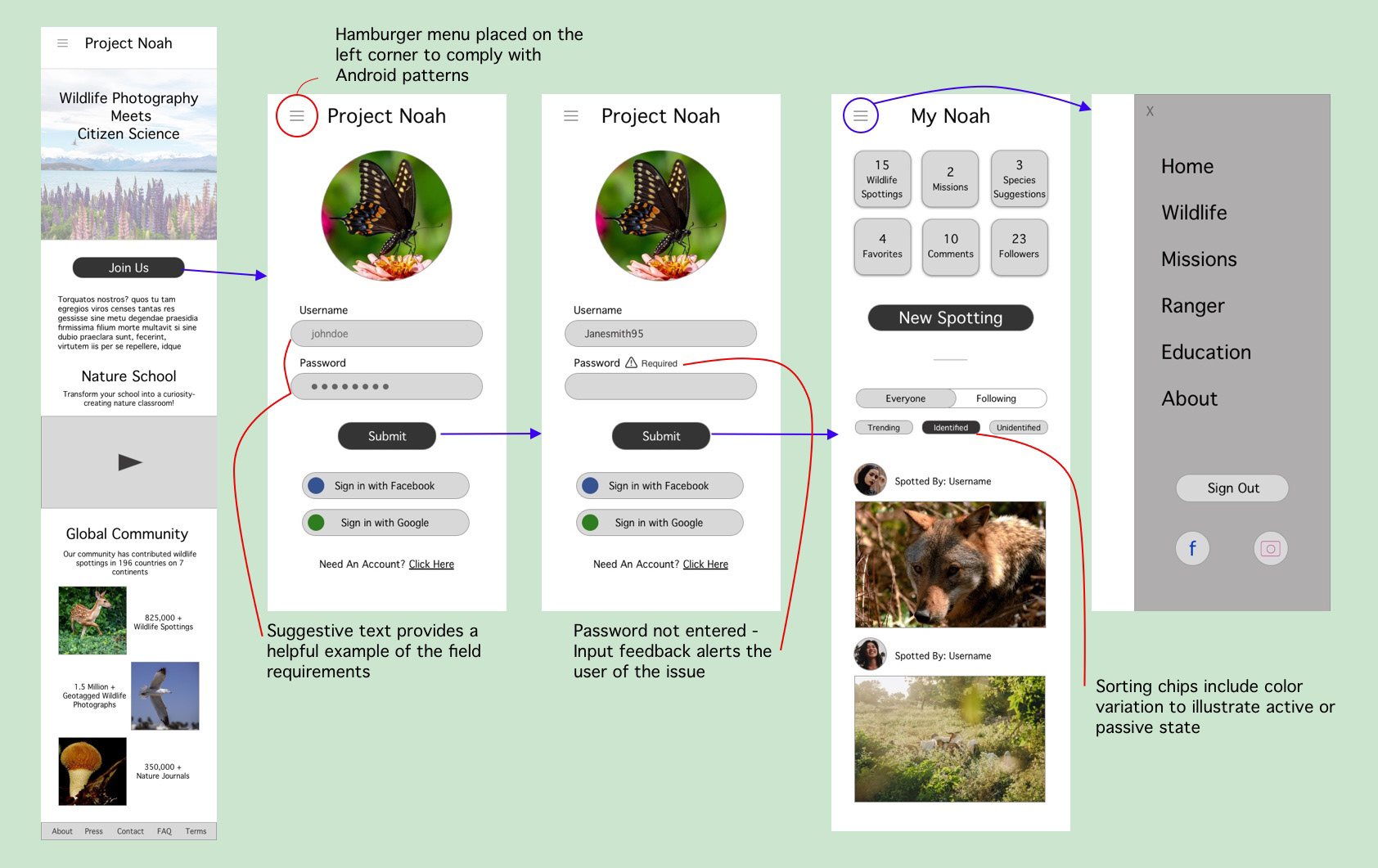
Once the barebones structure had been created, I progressively enhanced the wireframes with focus on spacing, hierarchy, design trends and patterns, typography, and color. Though this project intended to focus on the UI, my UX brain couldn't resist paying special attention to usability. Annotating the wireframes during the low-mid fidelity period assisted in keeping the users need at the forefront of the design process.
Mid Fidelity

User Feedback
In alignment with the fun and light hearted brand, I wanted to include a few whimsical yet subtle animations in response to gestures.
They needed to be sparse enough so as not to distract, and only applied to pages that aren't as commonly used in potentially service poor areas.
For example, I would not include an animation in the new spotting form, which is likely to be the feature most commonly used in the field.
Style Guide


Final Mobile Design


Responsive Breakpoints
Given time constraints, I opted to select three key pages with highly differing formats to make responsive. I added a tablet/medium and desktop/large for each of these features. Given additional time and resources, I would scale up the entire app to responsive design.
Home Page

User Dashboard


New Spotting Form
Mockups
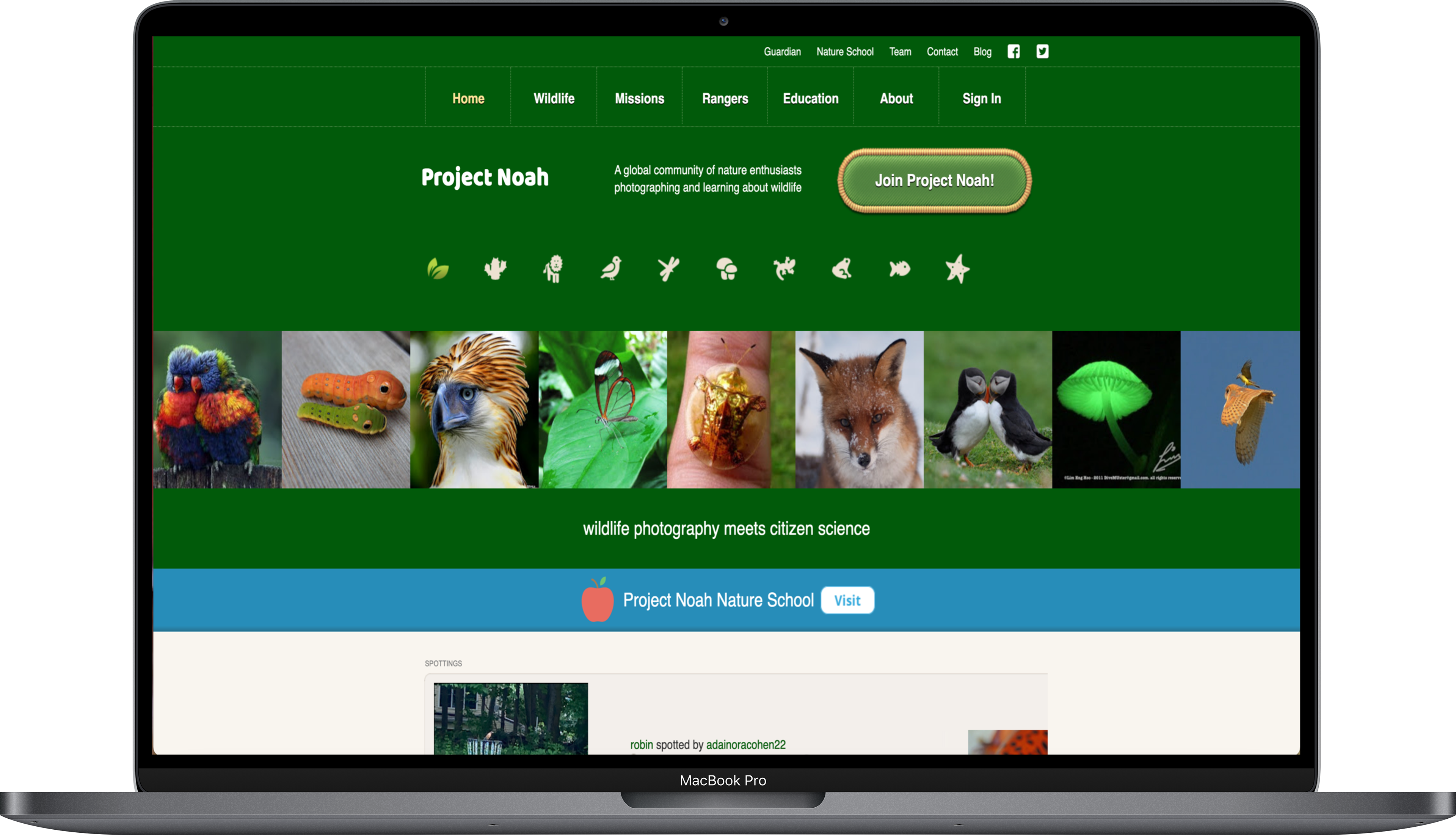
Before
After

Thanks for reading!